I had these two cardigans sitting like this the other day and thought it was worth sharing the photo.
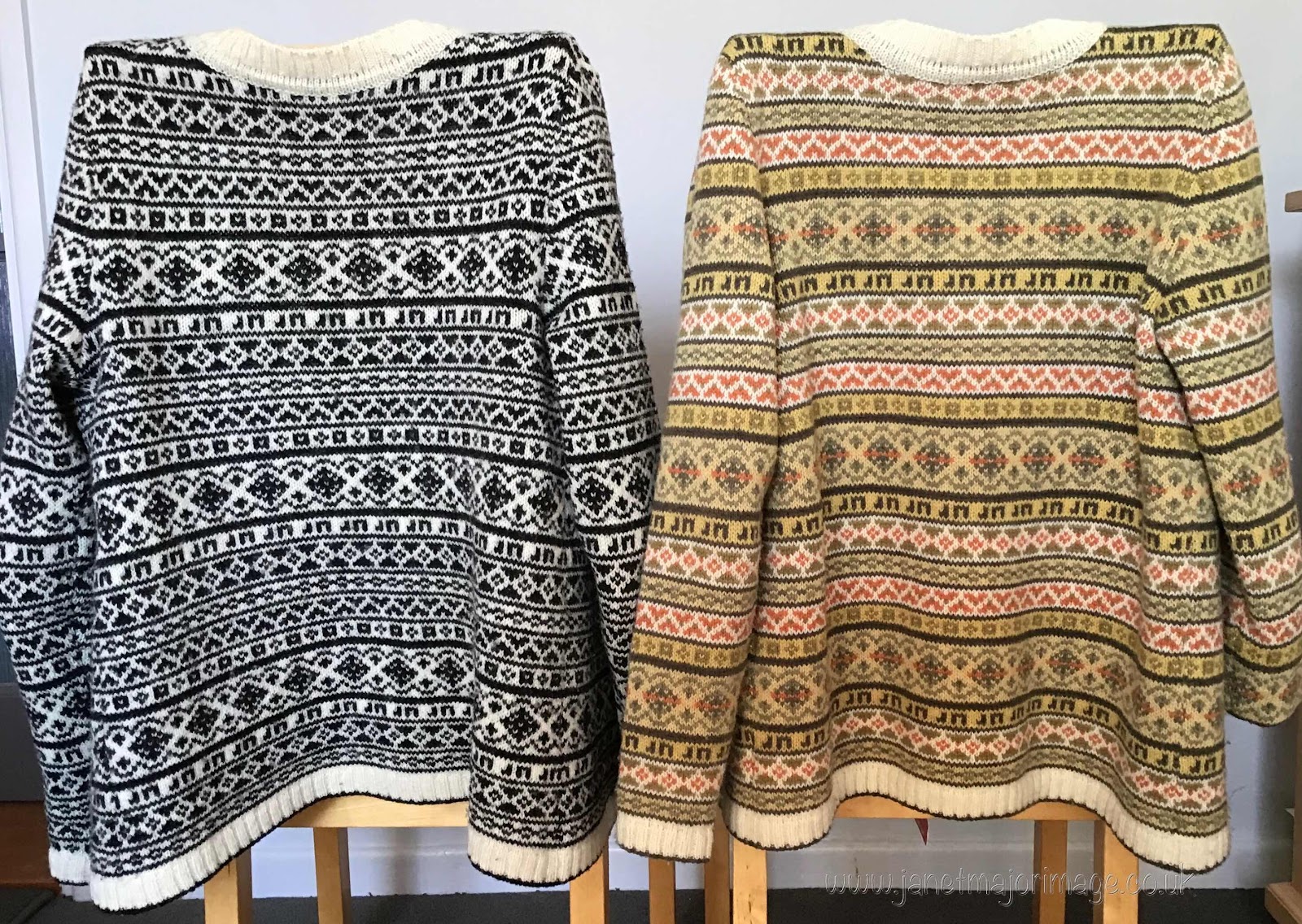
What was most noticeable was the difference the colours made to the overall patterns. I love them both and wear them frequently. I originally knitted the black and white one (2) as a trial for the naturally dyed one. It was a trial in terms of getting the size correct and the pattern placement, however how the colours work with one another ensures the natural dyed one is very different from the black and white one. Initially I decided on which colours to aim for in the dyeing with Ground Elder. Then I spent many days knitting samples and playing with colour combinations, hanging them up and looking at them close too and at a distance until I felt I had the combination that I loved! Somehow I know when the colours work for me. (By days I don’t mean whole days, I like to mull it over, do something else, come back to it, sleep on it etc. This is not something I can do in a hurry.)
Recently, I saw mention of an iPad app ‘The interaction of colour’ by Josef Albers. The cardigans are a good example of the effect of ‘interaction of colour’ (3). I am enjoying this app greatly and his take on colour does not begin with a colour wheel or discussions on complementary colours, triads of colours etc. He starts with working with colour and aims to help users develop an eye for colour. There is a lot in the app, I haven’t got to the end of it so I have yet to find out if he mentions the effect of a person’s colouring on the colours worn. But then that would make a good app on its’s own. I have seen several attempts at this but nothing I would want to recommend.
- I have previously written about the design and knitting of the Ground Elder cardigan beginning on 4 April 2018
- I call it my ‘black and white cardigan’ however the black is in fact ‘deep charcoal’ and the white is a ‘natural’ white, both from Jamieson and Smith . This combination gives a less harsh look for my light colouring.
- As I write this, the app is for iPad (not sure if there is an Android version), there is a free lite version, but the paid version is £13.99. It includes, text, plates, videos and has interactive activities to get you involved with understanding and working with colour.
LOVE! Both combinations are super. And your initials knitting in---totally classy.
ReplyDeleteThank you very much, glad you enjoyed the post.
ReplyDelete